Medical Illustration Tips: Contrast, Values, and Details in Your Digital Illustrations
IT’S ALL ABOUT BALANCING DETAILS
Today I wanted to share with you my art direction notes for when I review colorized digital illustrations and I wanted to take this time to focus on contrast, values and details.
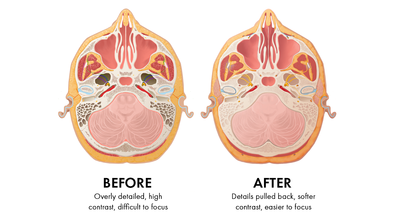
These three things, when used correctly, can help focus your viewer’s eye. Too much for these three can result in and overly detailed illustration with too much visual information that can make your illustration look overwhelming.
OVERLY DETAILED
What I see in a lot of work by beginner artists is the need to render out every single detail, every fiber, strand or hole. This approach can be done successfully by some master medical illustrators, but their illustrations are successful because they have a solid grasp on lighting and form when they do this.
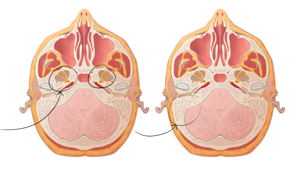
Let’s focus on the trabeculae in this example, which is something that we need to include for medical accuracy however it’s not the main focus of the story. Patterns such as these are best not to be shown in such an exact way.
ADJUST VALUES & TONE DOWN THE CONTRAST
In the second image, I’ve done a paint over where I’ve dropped the values and contrast to push back the trabeculae into the scene. The details are reduced enough so that it’s still visible to support the creation of the environment but not enough to fight for attention on the page and pulls focus away from your main story.
SLOWLY BRING BACK CONTRAST & SOFTLY HINT AT DETAILS
Once you have a base value/contrast level you can begin to push and pull certain areas to bring them into focus. Patterns and textures are really where light gets to become the star of the show and you can use highlights and soft shadows to pick out some small details here and there to hint at the trabecular holes.


